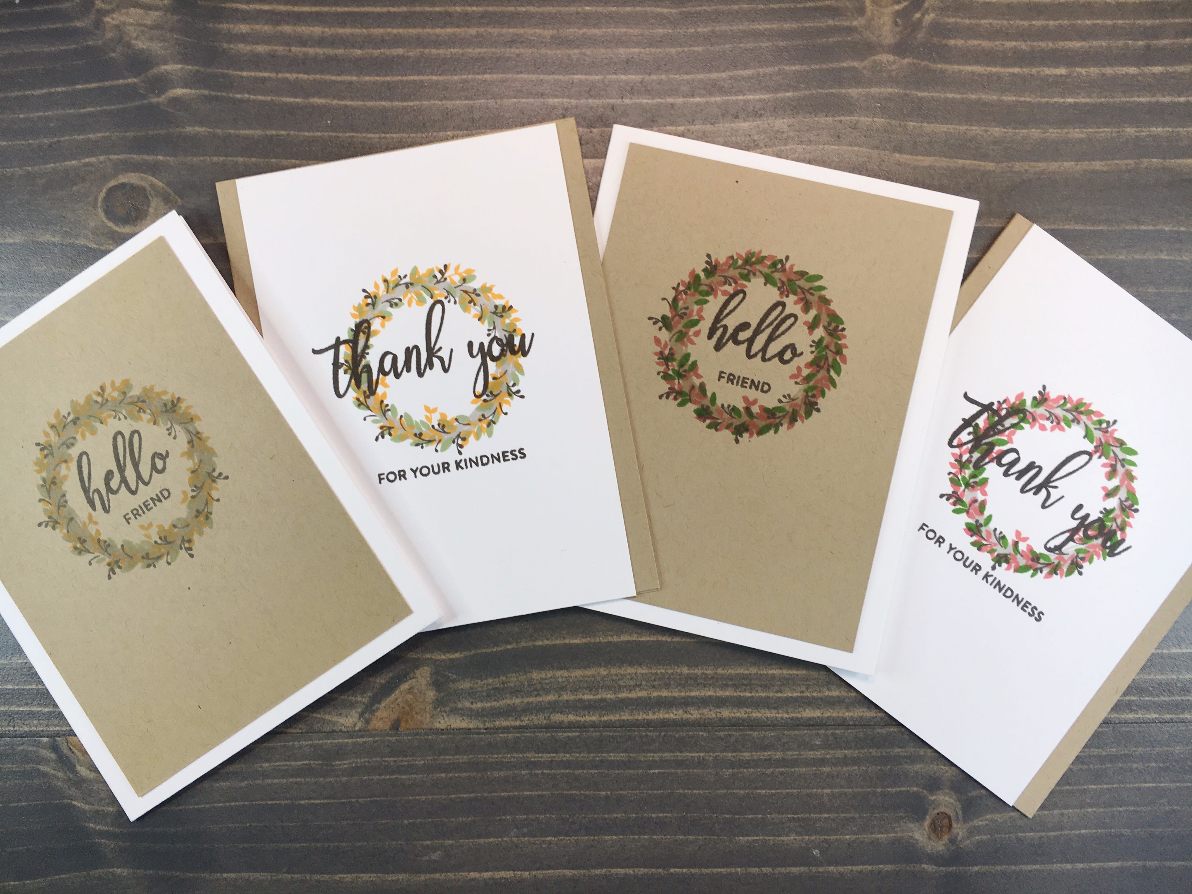
One of my favorite things about stamping is the ability to adapt a set to fit a multitude of situations. From masking parts of a stamp, to augmenting the stamped image of a stamp with a pen (or even cutting portions of a stamp away), to simply changing the colors you utilize when stamping – there are plenty of options to customize a project.
Color palette is one of the easiest ways to personalize and customize a project. Today, I’ve utilized one stamp set to create two card designs, then repeated the process switching out only two colors.
The result is summer themed cards vs fall themed cards – same design, yet entirely different feel.
Follow along and see how you can incorporate different colors into your projects to expand the usability of sets you may feel are out of season or not quite right for your current needs.
Today’s card uses the W Plus 9 Welcome Wreath stamp set. This set is great as it has multiple layering options to create numerous wreaths. In addition, it includes sentiment options ranging from Welcome Baby, Thank You for Your Hospitality, Hello Neighbor, and more variations.
Set 1 - Summer Colors
Ink Colors used – all Simon Says Stamp: Fog, Rose Apple, Green Leaf, Sparrow
First, I started with the wood base stamped in Fog. Next, I layered leaves stamped in Green Leaf. Smaller sprigs of leaves were then added in Rose Apple, and I finished with smaller wood sprigs using Sparrow.
I stamped both card panels with each stamp as I was using my Misty Stamping Tool before moving on to the next layer.


Set 2 - Fall Colors
Finishing Cards
I stamped sentiments using Sparrow ink for all cards.


After all card panels were stamped, I trimmed the white panels to 5 1/2” x 4 3/4”. I adhered them to an A2 card base cut from Gina K Kraft cardstock, centering the white panel.

Taking the Kraft panels, I trimmed them to 5 1/8” x 3 3/4”. I adhered them to an A2 card base cut from Neenah Classic Crest 110lb cardstock, centering the panel in the center.

These cards have a simple card design, yet the layered image creates a fantastic and detailed focal point. By simply switching out two of the four colors, I have cards perfect for use in both summer months and the fall. Such a simple way to customize a set to the current season.


